What is typography?
Whether it’s content on billboards, on TV, on the internet, or on our phones, we’re constantly making sense of the written word. It’s not just in printed books: from the packaging of groceries to posters on public transport, text is everywhere. You may notice that each different kind of medium or interface presents text differently. The shape, thickness, size, and spacing of letters in the content can all differ, depending on the purpose and the audience. The style in which text is designed or presented to us is called typography.
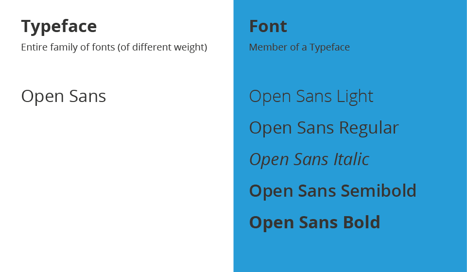
In the earlier days of print, “type” referred to the physical metal blocks that were inked to print letters on paper. A typeface was the set of all letters created in a similar style. You may have heard of typefaces like Helvetica, Times New Roman, and Calibri. Every typeface has multiple variations—bold, italics, light, and different sizes (10-point, 14-point, etc.)—called fonts.
The purpose of typography is more than just making text readable or decorative. Typography can add to the meaning of what you want to say—or detract from it. For instance, the typeface you choose, your layout, color scheme, and images for an invite to a birthday party will probably be very different from the choices you make for an academic paper. Your typographic decisions can make or break your work even when your content is great. Knowing the basics of typography is an essential skill for anyone who works on documents, designs, and projects where content must be presented to an audience. In this article you will learn everything you need to know to get started with typography.
Why is typography important?
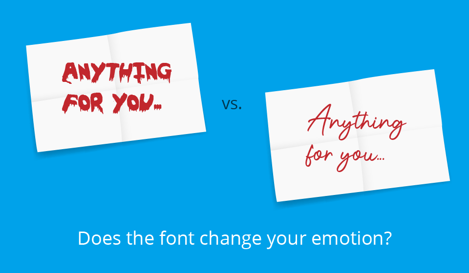
Typography can have a major impact on how a person perceives and understands content. Elements like color scheme and font contribute to the overall message that content conveys. Look at this example. Does the font change the meaning of the words?
Typography can influence your mood and ability to comprehend content. Appropriate typography is essential for engaging an audience while reducing cognitive load. Typography should prioritize readability and accessibility, and it should enable an engaging user experience. Let’s look at the different elements and aspects of typography.
Elements of typography
1. Fonts and typefaces
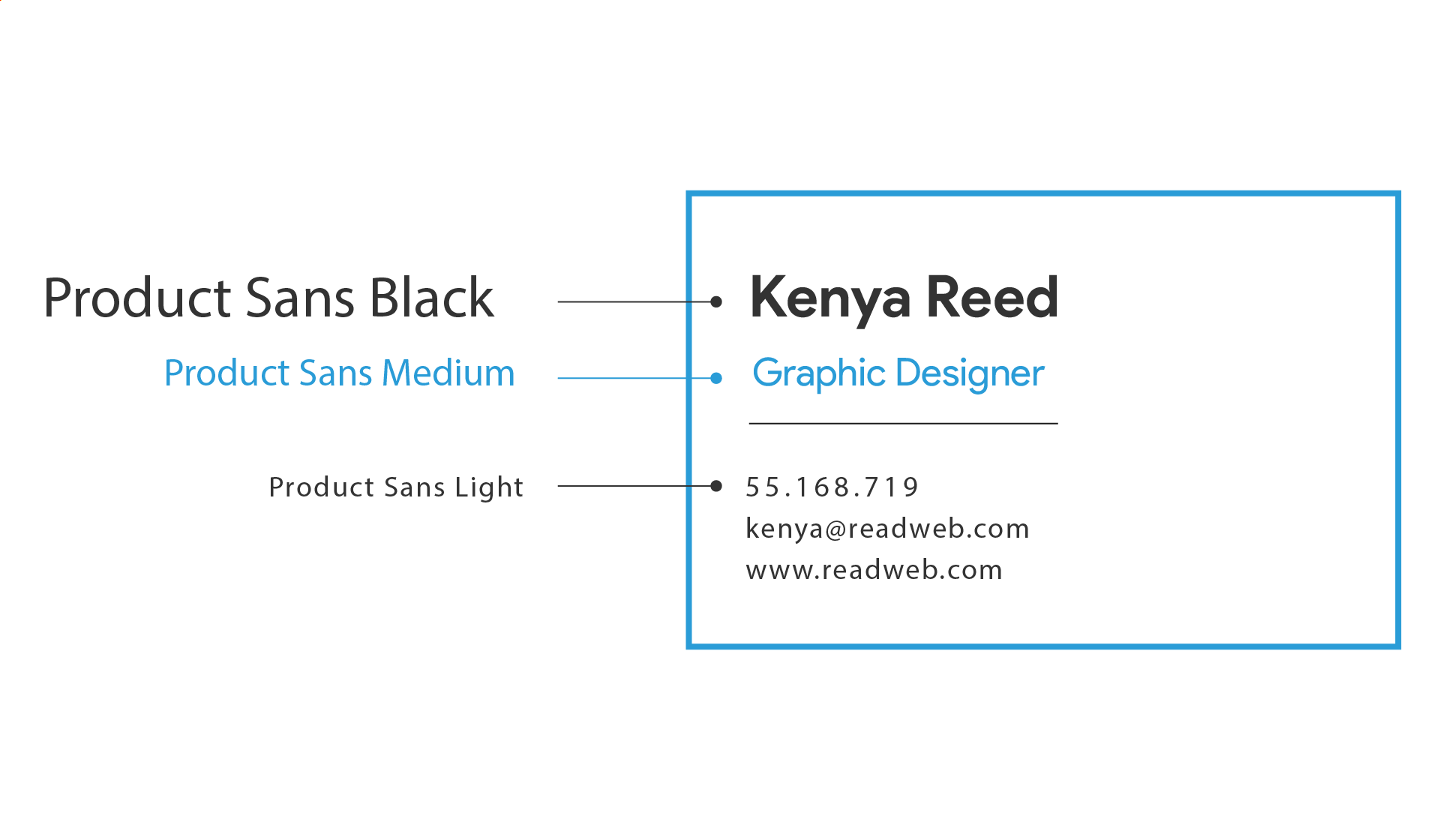
A font is a set of characters of a single size, width, and style. For example, if you use Times New Roman, regular, 12-point in a document, that’s a font. A typeface consists of sets of similar fonts of different weights, widths, and styles. In simple terms, a typeface is a family of related fonts.
2. Kinds of typeface
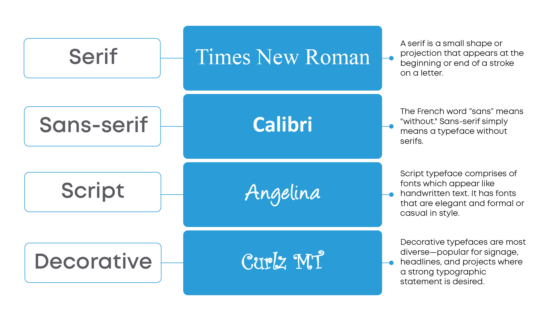
Serif, sans-serif, script, and decorative are the four basic types of typefaces.
3. Leading, kerning, and tracking
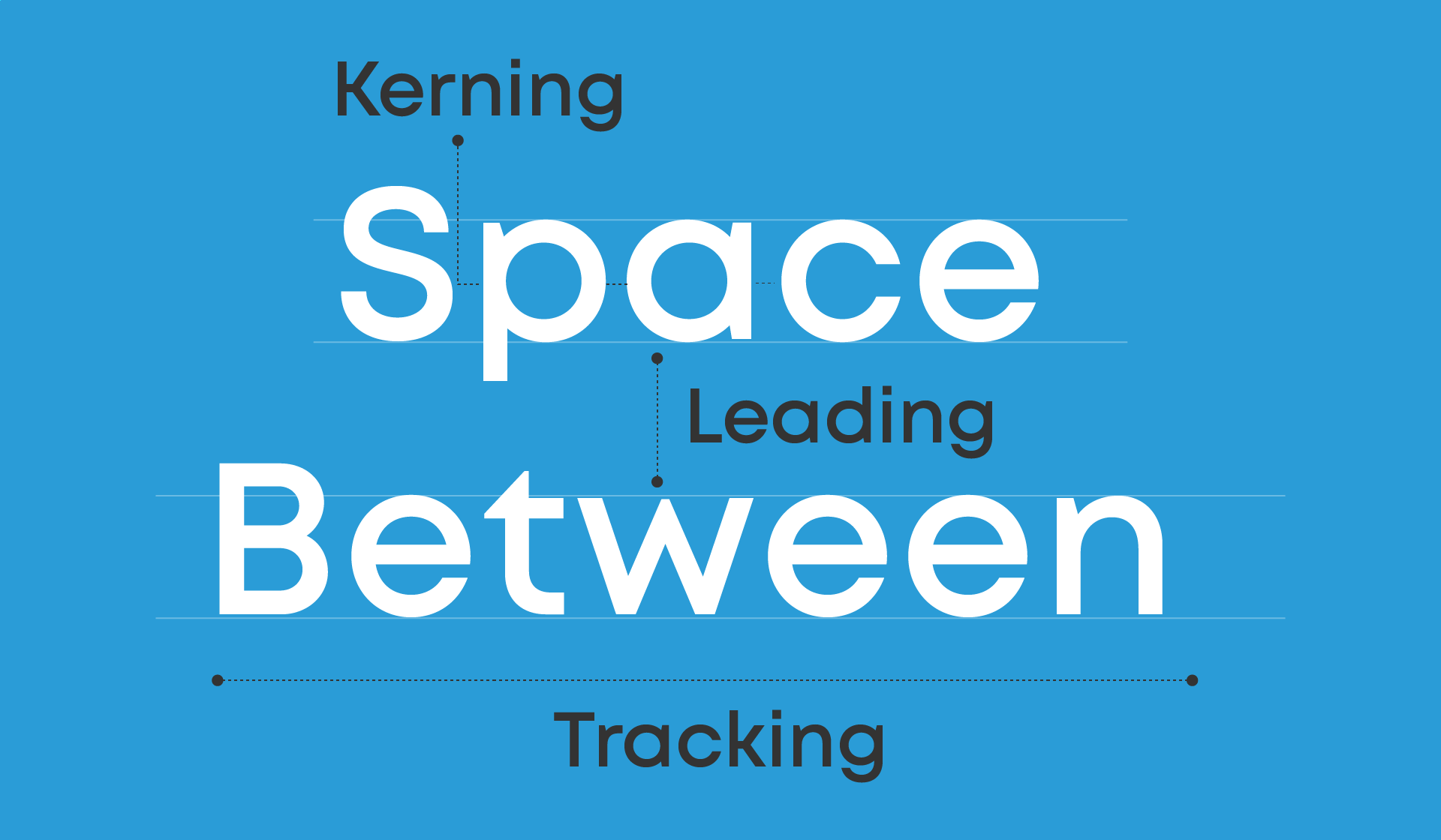
These are aspects of typography that are related to spacing. Leading (pronounced “ledding”) is the space between lines of text. Kerning is the space between two individual characters, which is generally designed by the type designer but can often be tweaked. Tracking refers to the overall letter spacing of an entire word or passage of text. Adjusting the space can make a block of text feel open or crowded. This can therefore affect ease of reading and cognitive load.
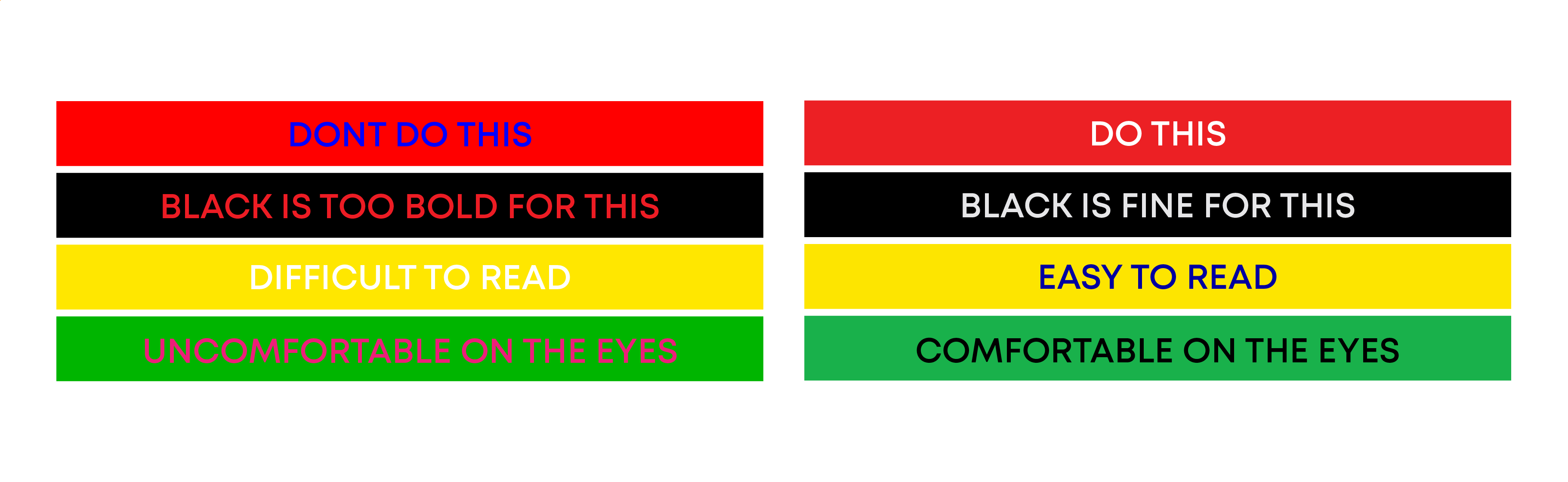
4. Color
Though the color of text is limited in most types of print, an online medium allows you to make use of color. Text color should be chosen with care. The right combinations of text and color can emphasize your message, make it more attractive to readers, and aid in understanding. The right font color makes your text stand out and conveys the right tone of the message. Getting it wrong can result in a messy presentation and text that clashes with the message.
5. Hierarchy
A hierarchy is the order in which different pieces of text should be read on a page or screen. Creating this hierarchy in text is a vital function of typography. This hierarchy distinguishes text that should be noticed and read first from less important or more detailed text that should be read last. You can use different elements to create a hierarchy of text: text size, the color of text and its surroundings, contrast, and positioning or alignment. For instance, newspaper and blog articles use different fonts and font sizes to create a hierarchy. The large font sizes and weights of the headline and subheadings encourage you to read them first, while the smaller text size of the rest of the article means that you will read them later.
6. Consistency
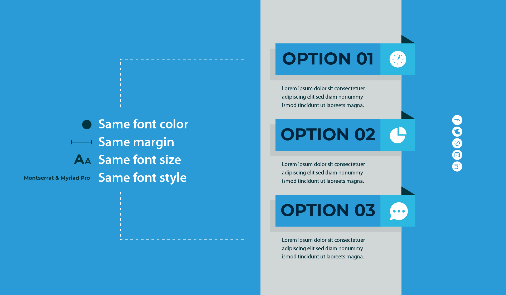
It’s important to keep the design of your document consistent from one page to another or one slide to another. Using consistent background and text colors helps readers connect the different sections, while a document or presentation that has different fonts, colors, and designs on each page will look messy and be difficult to read and understand. To keep your typefaces consistent, never use more than three fonts in a single document. The text size should be in keeping with the text’s position in the hierarchy: establish one font size and type for the main title, another font size for headings, another for subheadings, and the smallest size for the body text.
7. White space
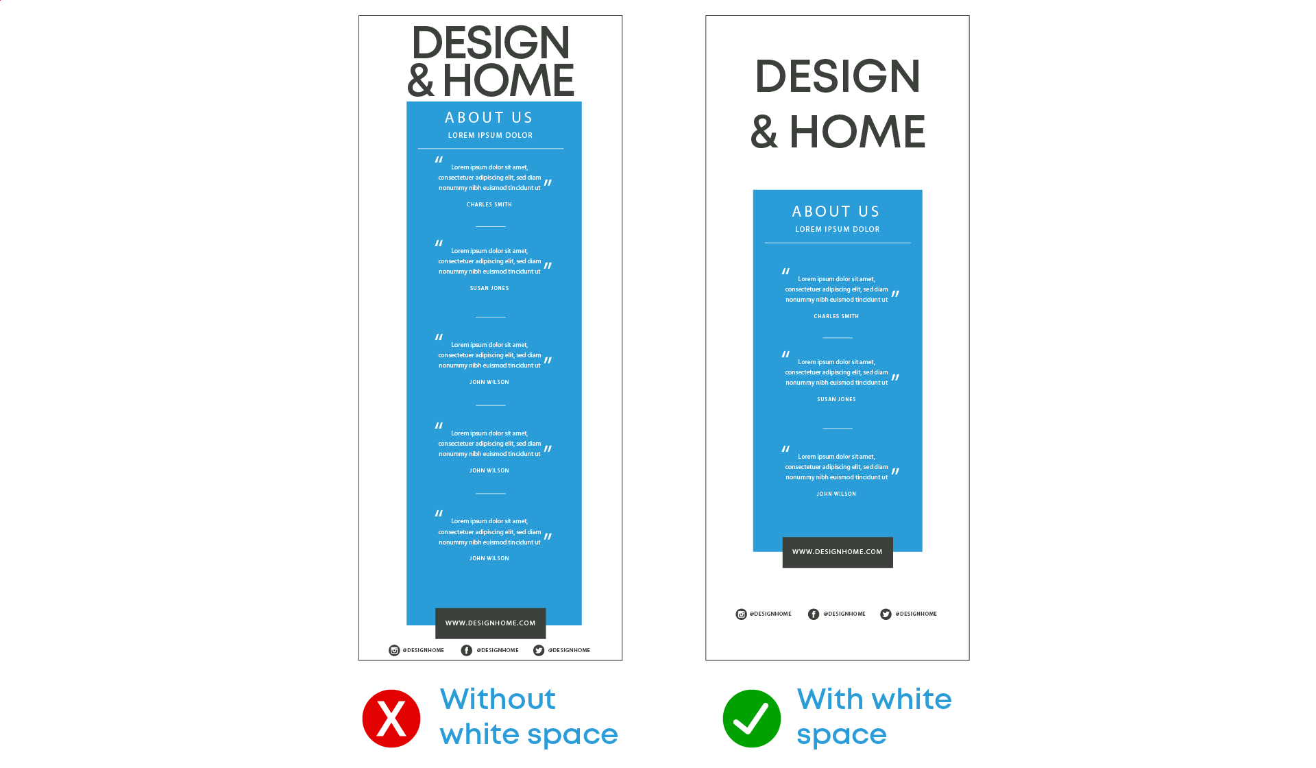
While other elements of typography focus on the letters themselves, white space (or negative space) is the space around the text and images. Readers may not notice white space specifically, until there is too much or too little. Using the appropriate amount of white space makes it easier to read the text and helps readers understand the connections between different parts of the text.
The influence of typography on online learning
While developing any online content, it is essential to consider visual design as well as instructional design. They have an impact on the overall communication process. In this case, strategic use of typography plays a critical role in the visual design and impact of a course. Studies have shown that learners assign emotion and personalities to fonts. Thus, it is important to choose fonts carefully to match the tone of the course. Typography planned well improves readability, information processing, engagement, and the overall effectiveness of an eLearning course.
Explore how ansrsource applies typography in learning
At ansrsource, we combine the science of typography, design, and learning psychology to make digital learning engaging and accessible for all.
Content digitalization
Our content digitalization solutions combine visual communication, typography, and instructional strategy to create engaging, effective eLearning experiences.
Granulearn
Granulearn delivers bite-sized, high-impact learning experiences optimized for digital platforms. Thoughtful typography, clean layouts, and responsive design ensure content is easy to read, visually appealing, and consistent across devices—helping learners absorb more in less time.
Let’s consider various learning environments and the use of typography in each of these cases:
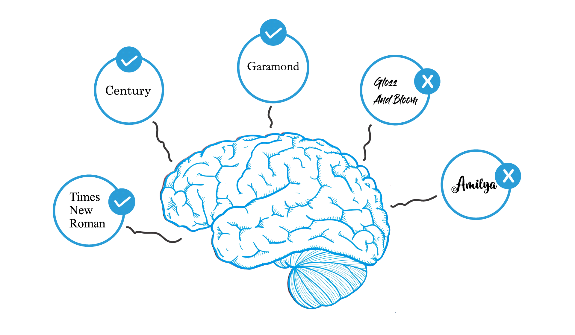
1. Fonts used in printed study material
Serif fonts are preferred for printing as our brains process them more easily. They are also effective for use as body text because they are much less likely to cause fatigue from reading. Typefaces like Garamond, Times New Roman, and Century are some of the fonts used in print.
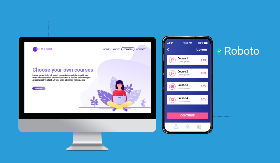
2. Font for online courses and web and mobile interfaces
Most people find the simple shapes and generally uniform width of sans serif fonts easier to read on computer monitors. Serif fonts can be hard to read due to the lower resolution of computer screens as compared to printed materials. Depending on their design, the fonts can evoke different feelings, either engaging the user or causing them to disengage completely. A user looking at a higher education course or professional training course will expect fonts that evoke professionalism, seriousness, and warmth. Helvetica, Arial, and Futura are commonly used while designing online course content. Sans serif fonts are most preferred for mobile and web apps as they are versatile and are less likely to cause stress on the eyes. Some of the most widely used fonts are Roboto, Nunito Sans, Open Sans, Montserrat, and San Francisco.
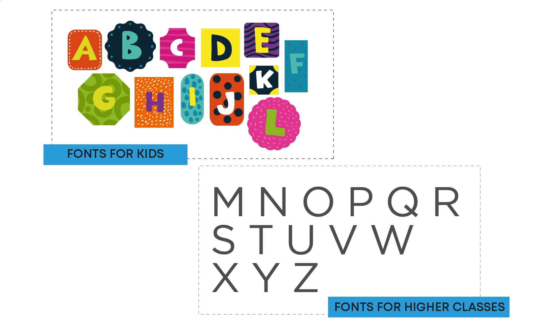
3. Fonts for the K-12 segment
Fonts for school children can vary widely. Content for younger children often uses decorative fonts with bold and bright colors to attract their attention. As they grow and as the content that they access changes, their preferences tend to change to more mature fonts that are less colorful but are still easy to read and comprehend.
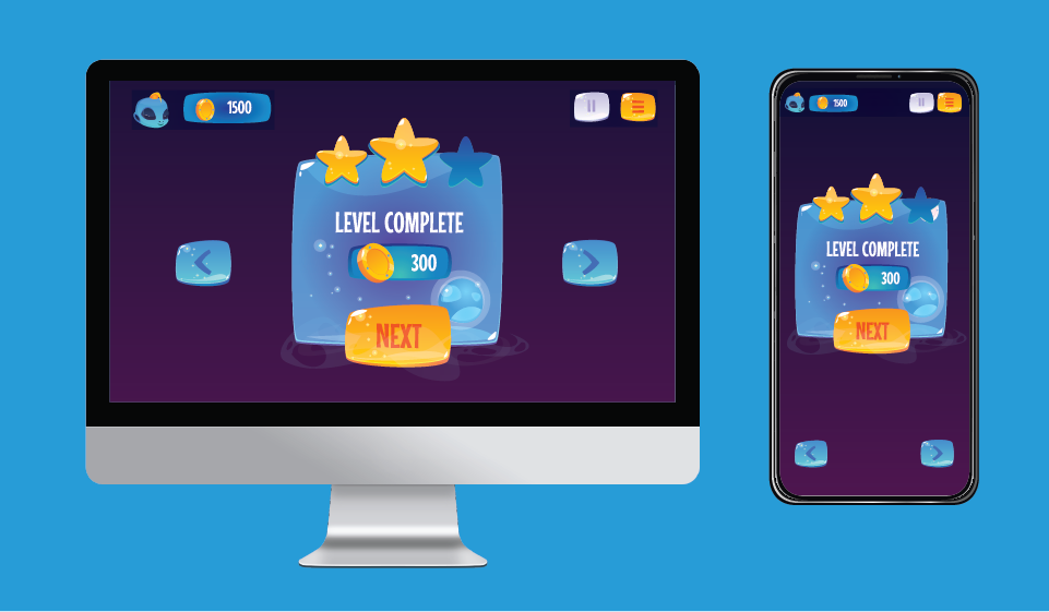
4. Fonts for games
Another area where fonts play an important role in conveying atmosphere is in video games. The kinds of typefaces used convey the setting of the game and allow the audience to get an idea about the content of the game. Games also have a lot of onscreen text—instructions, hints, scores, story settings—that needs to be communicated easily and quickly. Readability is the priority here. Players may access the game from a variety of devices and in different languages, and the font chosen should lend itself to these practical requirements as well.
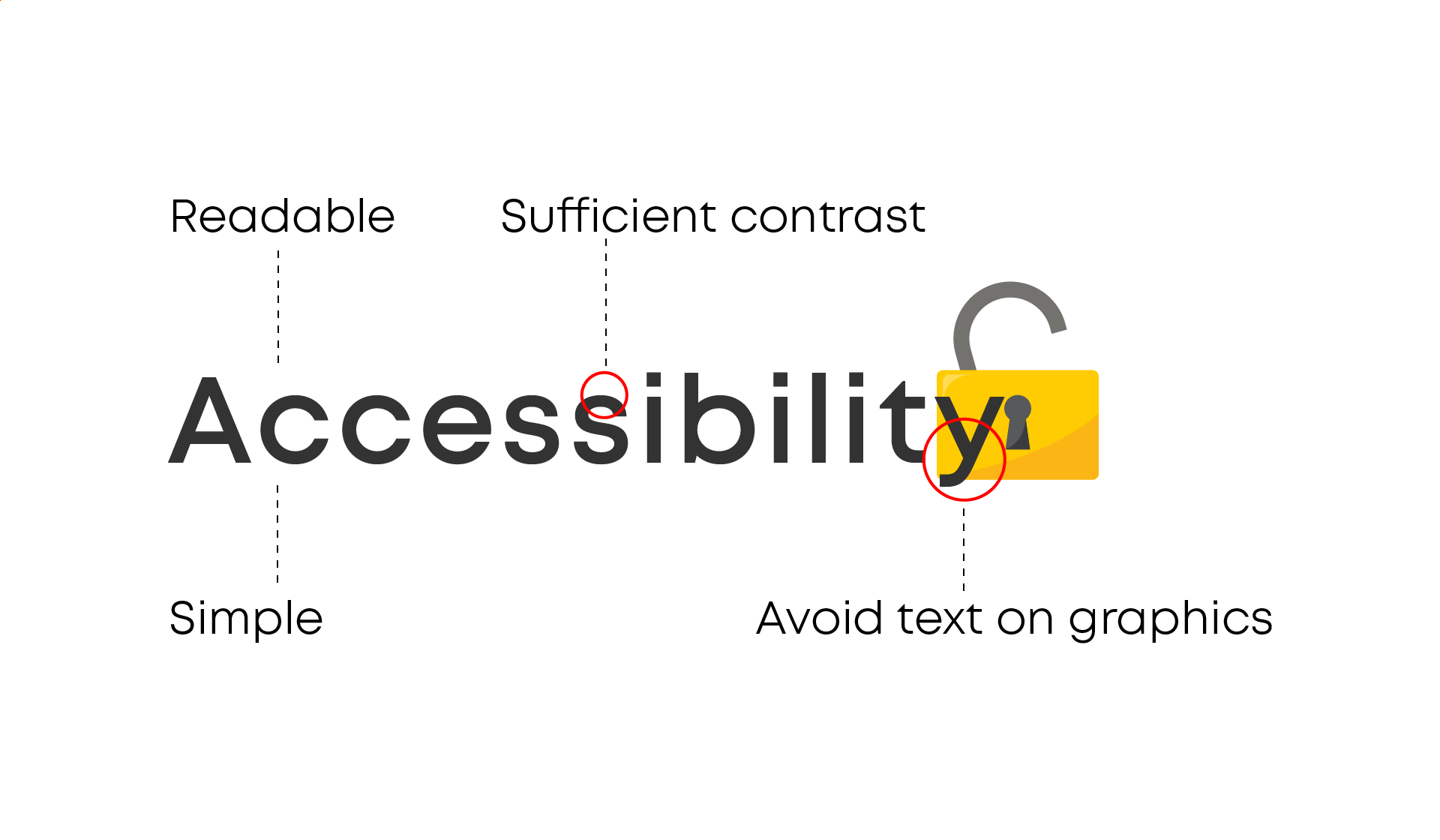
5. Fonts supporting accessibility
While choosing the perfect typeface for your content, be sure to consider how accessible it is to users who might have difficulties reading text. Here are a few points to keep in mind to make sure your content is inclusive.
- Select simple, readable fonts.
- Use a maximum of three fonts.
- Ensure sufficient contrast between the background and the text.
- Use a font size of 12pt or above.
- Restrict the use of multiple font variations such as bold, italics, and ALL CAPITAL LETTERS.
- Avoid using text within graphics.
- Avoid moving or blinking text.
- Ensure that you use the right color combinations to aid readers with colorblindness.
The success criterion to measure accessibility is to pass WCAG 2.0
A number of free accessibility testing tools are available online. You can use these tools to test your content for a number of common accessibility issues. Here’s an online contrast checker that will help you to find a color that meets the desired level of contrast.
The basic guidelines discussed here will go a long way in ensuring that your content is easily readable, engaging, and accessible to all.